
💫 Flexbox 레이아웃 사용법
<div class="flex-container">
  <div class="box"></div>
  <div class="box"></div>
  <div class="box"></div>
</div>
.flex-container {
  display : flex;
}
.box {
  width : 100px;
  height : 100px;
  background : grey;
  margin : 5px;
}
부모 요소에게 display : flex 사용
세로정렬 → 가로정렬
💫 Flexbox 세부속성 사용하기
.flex-container {
  display : flex;
  justify-content : center;/* 좌우정렬 */
  align-items : center;/* 상하정렬 */
  flex-direction : column;/* 세로정렬 */
  flex-wrap : wrap;/* 폭이 넘치는 요소 wrap 처리 */
}
.box {
  flex-grow : 2;/* 폭이 상대적으로 몇배인지 결정 */
}
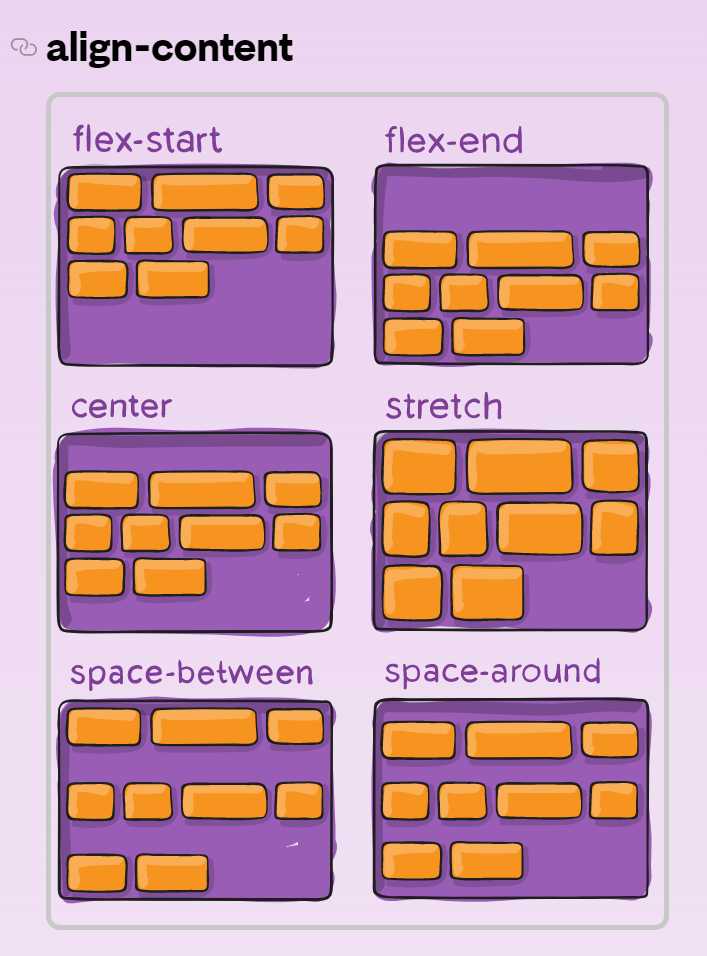
💫 align-content
justify-content의 세로버전
답글 남기기